
Urban escape in the heart of the city
Intro
The brief was healthcare and wellbeing, plus luxury. That was all of it. No client, no constraints, full creative freedom.
A two hour immersive spa for people who cannot leave the city. Science and spirituality in the same room, and a brand that had to make that read as one idea rather than two.
Discover
Designing inside constraints
That set the boundaries everything after it worked within.
Discover
Research to idea
General research first, to understand what healthcare and wellbeing covers and where it sits now. The facts and insights below are what led me to the idea.
Facts
- Burnout in the UK had risen to 79 percent, 35 percent of it extreme
- Wellness spending shifting toward holistic and preventative
- Rising interest in health and sustainability
- Appetite for technology in health rising, but interest in holistic approaches rising alongside it rather than instead of it
Insight
- Modern individuals need an escape for their wellbeing
- They are more committed to the sustainability and longevity of their wellbeing journeys
- Interest in technology for health is rising, but holistic approaches remain in heightened demand
Final concept
To build a multisensory escape from the city, in the city. An immersive two hour retreat that uses science and spirituality to move you somewhere else for a moment, then anchors it into daily life through the subtle use of NLP.
Discover
The category
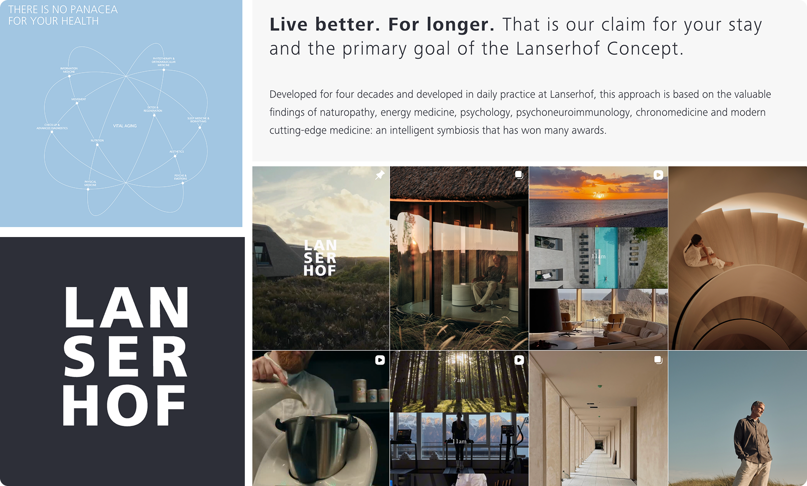
Lanserhof
Combine holistic medicine with sustainable regeneration and prevention
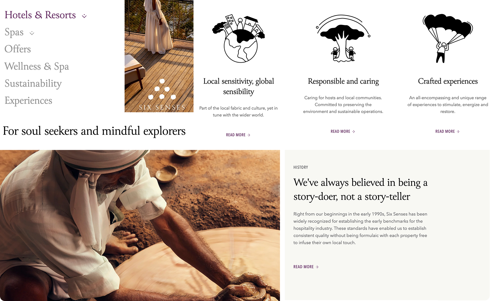
Six Senses
Build and design sublime experiences without diminishing the natural world
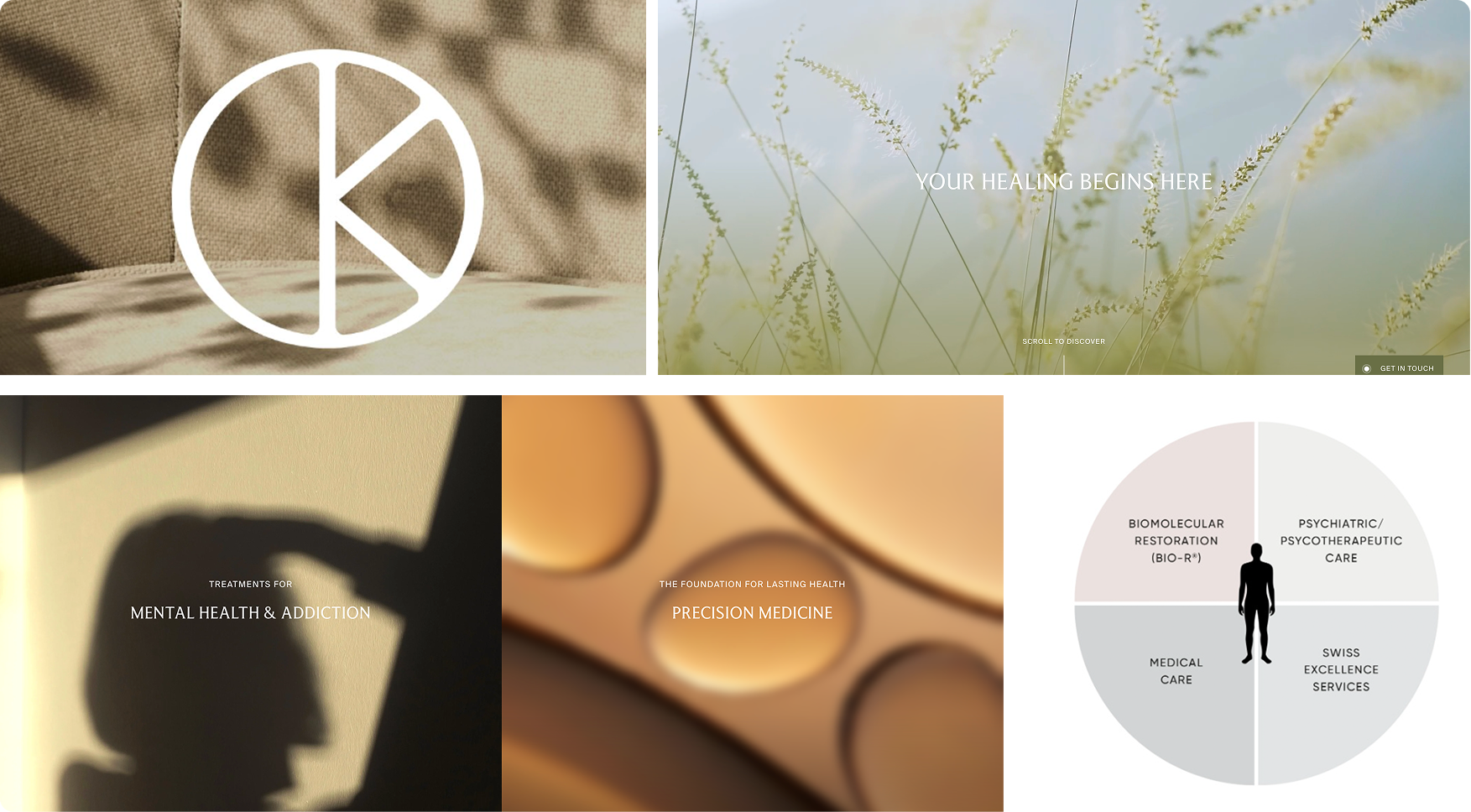
Kusnacht Practice
Professional, bespoke care in the most luxurious environment
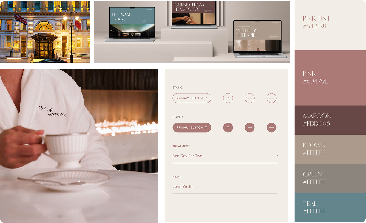
ESPA at the Corinthia
Your ultimate wellness retreat across four luxurious floors
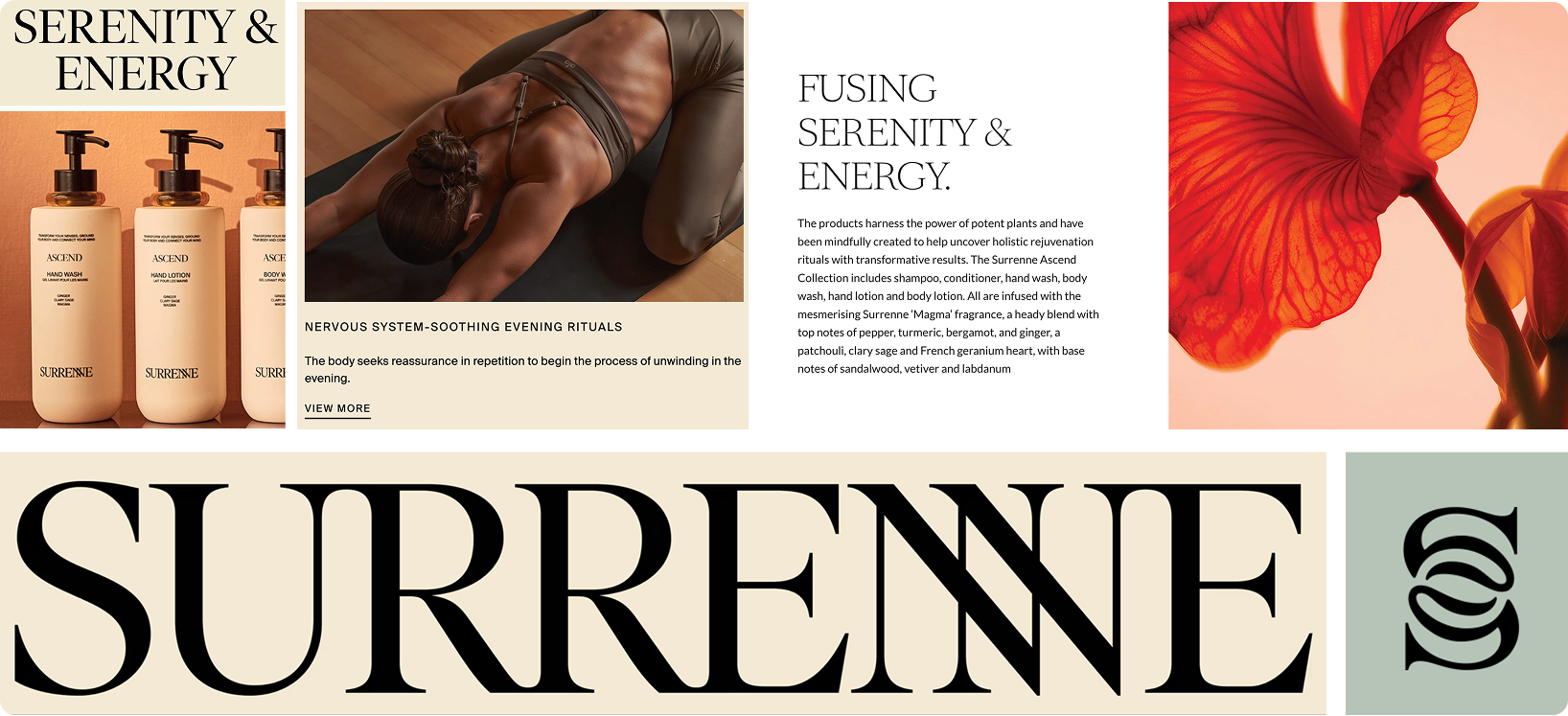
Surrenne
Alleviate the strain caused by modern life
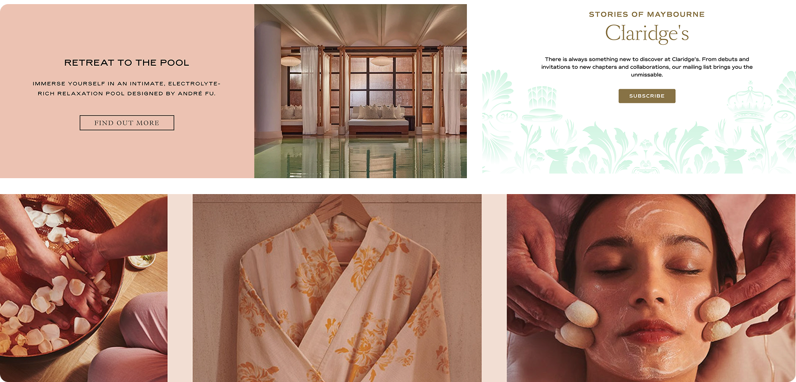
Claridges
Personalised treatments designed around high performance lifestyles
Discover
The interview that built the model
Her suggestion became the business model. Ask where someone wants to escape, simulate it, run a hypnotic background under the session, then sell them the scent they smelled inside it. The scent becomes the anchor. They smell it at home and the subconscious returns them to the escape.
The retreat stops being two hours long. It becomes something they take with them.
Secondary research
Discover
Who it is for
The interviews changed the direction. Both women described needing an escape more urgently than the man did, which told me the identity should read gender neutral but lean feminine, because that was the wider audience.
Define
Brand essence
I ran it through temple, pyramid, onion and golden circle to find the traits that could hold both. What came out: serene, inspiring, conscious, timeless, sophisticated.
Develop
Three directions
Emori pushed the same idea toward gender neutral. Feedback said generic. The instinct was right, the execution was borrowed.
Direction three went the other way. Eclipse forms, high tech gradients, Alice through the looking glass. Cleaner, but no personality and nowhere left to push.
Direction three won, but it was not finished. The eclipse forms and the tech gradients were right. What it lacked was the mystery I had built in one and two, so I kept pushing until both were in the same system.
Develop
The name
Should convey
tranquility, sanctuary, serenity, luxury, wellbeing, holistic, light
Should feel
relaxation, unique, freeing, peace, natural, positive
Should sound
soothing, lyrical, melodic, harmonious, soft vowels
Scope worked because the O sits in the middle of the word. It is the entry point. You delve into it. Once the name landed, the wordmark, the submark and the graphic system all followed from that one letter.
Develop
Art direction
Vast landscapes with gradients blended into them. Then the submark: the O filled with the same gradient, black at the edge running into colour, so the mark reads as an inner sanctum surfacing.
Colour came from the same place, plus a risograph workshop. Coral fluorescent leads, deep turquoise against it, offblack and white holding the luxury simple.
Deliver
Identity
Deliver
Application
The packaging carries the concept through. The client opens the escape they chose, and the box is made to match the immersive room they entered.
Marketing had to work where the audience actually is. Not tube and bus stops, but the road out of the city. A billboard on the highway reading you didn't have to leave the city to escape, caught at the exact moment someone is leaving it.
The second idea takes the threshold literally. Lift doors that open onto a rainforest, so the ordinary act of stepping into a lift becomes stepping into somewhere else. The brand is about crossing into another world, so the applications had to be places where a crossing already happens.